Introduction
Huang Fang
Teacher of Visual Communication and Design, EAaD School of Art and Design
Master of Art and Design (the first batch of Master of Fine Arts (MFA) recognized by the Ministry of Education)
Former Visual Director of Shaanxi Woman Friend Media Group
Winner of GDC17 and GDC21 Excellence Awards for Design Works
The "GDC Award" is the most influential and prestigious prize for designers in the Chinese community. The GDC Award has attracted designers from all over the world, and is being upgraded from the "World's Top Chinese Design Award" to one of the "World's Most Influential Design Award". GDC21 received 9,787 candidate works from all over the world, hitting a new record high again, with a selection rate of only 4.6%. 」
Nominee of two awards of Macau Design Award 2021
「The Macau Design Award 2021 has received more than 3,600 candidate works from 22 countries and regions. After rounds of review, 120 works won the award, with a winning rate of 3%. 」
American author Helen Keller said in her book Three Days to See that if she was granted three days to view the world, she would visit the museum one day. Museums all over the world seem to run the rule that items must not be touched, but only be viewed. When we asked "what is the nature of design", Mr. Huang Fang shared a case with us: in an art gallery in France, a relief sign is placed before the painting, and the blind and visually impaired can create an image of the painting in their mind by touching the relief. This design opens the door for the blind to appreciate the visual art.
On a display board of EAaD School of Art and Design, we notice a saying: "Design is the solution to problems, while art is an issue about problems." Why are we designing? What's good design? What kind of art education are we devoted to? You may find the answers below.
Establish the rules first, then break them
Q: When did you join Xi’an Eurasia University?
A: I joined Xi'an Eurasia University in 2014, so I have been a teacher for 8 years, but I have been engaged in graphic design for a long time. I worked for a magazine for 17 years as a visual director, mainly responsible for layout design. After I came to Xi'an Eurasia University, my job has changed, but I teach about layout design. What I teach now is Layout Design
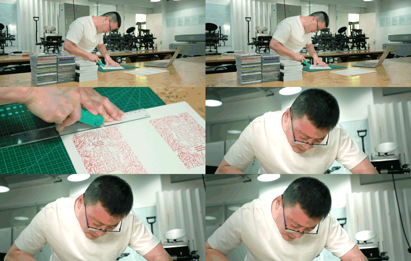
Q: Would you please introduce this course, Layout Design?
A: Yes. Judging a graphic designer's professional proficiency is largely based on his grasp of font and layout. Therefore, Layout Design is a core course in the major of visual communication design, which is provided to students in three consecutive semesters, from Layout Design I to Layout Design III, which is an escalating process.
Layout Design I will focus on solving some basic typesetting problems, including the application of fonts and the use of grids. At this stage, students are only required to use grids correctly. In Layout Design II, students need to apply the grid flexibly and explore as many layout possibilities as possible under the grid rules.

Layout Design III is more complicated than Layout Design I and Layout Design II. At this stage, students will learn how to break grids. It doesn't mean that they will not use grids. Instead, they will use a more complex and effective grid rule. We will no longer follow the original horizontal and vertical frame grids. The grids need to be reset according to the program's characteristics. They may be divergent or spiral, etc.
Q: What does the grid mean to layout design?
A. The grid is invisible, which is a rule or an invisible ruler that guides us how to arrange our designs, orchestrate the hierarchy of information for design purposes.
I often give a simple example of a grid. It is like partitions on the bookshelf. Some partitions are wider, while some are narrower. We put picture albums between wider partitions, and novels between narrower ones. In the layout design, the grid is like a bookshelf on the plane. We put titles in one grid, pictures in another, and texts in some others, so that readers can see our information very clearly. This is how the grid is used.
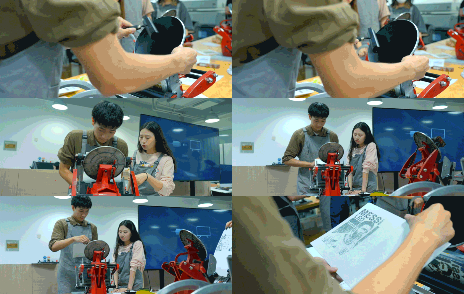
Q: There are many relief printers here in this classroom, which look time-honored and even some niche. Why do you use such tools in the Layout Design?
A: Indeed, relief printing has been outdated, but why should we still introduce it into the classroom? First of all, one of China's four great inventions — movable-type printing — is actually relief printing, and our studio is called "movable-type printing studio". I hope that college students in the new era can personally get access to the historical movable-type printing, which is an inheritance of Chinese civilization.
Secondly, relief printing is a simplified printing process. The printing technology has greatly evolved. It is not an easy job to make sure students are aware of today's printing technology. However, through the practice course of relief printing, students can quickly understand the complete printing cycle of plate making, transfer printing ink and finished printed products in class. Understanding the upstream and downstream processes is very helpful for designers' design work.
Q: Are students given opportunities of program practice?
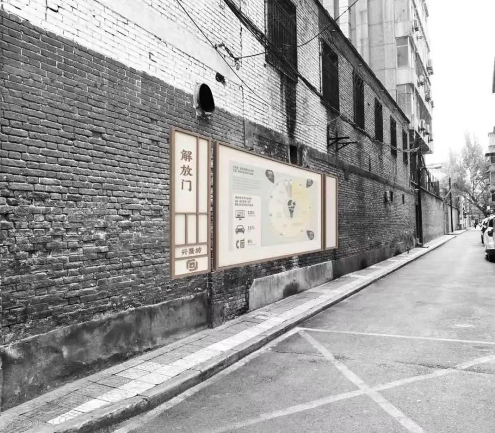
A: Xi'an Eurasia University hopes to cultivate application-oriented talents, and I have years of the front-line work experience. So, I often introduce some real-world practice programs in my teaching, and students can solve problems on behalf of real customers through design. EAaD also has a lot of Industry-University-Research Programs, which will allow students to get a lot of exercise in practice. For example, students upgraded the visual image of Jiefangmen Block in Xi'an, which involved street guidance, maps, cultural and creative and other aspects closely related to people's lives.

Observe places that others can't see
Q: What homework do you ask students to do after class?
A: I will ask them to observe their surroundings and common things in daily life, but this is actually from the observation perspective of public. As a designer, you may have to observe things from a different perspective.
I used to show students in class the speech video of Yui Takada, a Japanese designer, who taught students a way to observe things — to observe things that others can't see. For example, observe the bottom of the tetrahedral package and the lid of the instant noodle cup. When you observe their content and arrangement, think about their effects, and paint them by hand, you will find out a lot of new problems. This is a method of improving the designers' observation.

Q: Have you ever observed any detail of design work which was unnoticed but impressed you?
A: In 2018, I visited Echigo-Tsumari Art Triennale in Japan. The little town is seriously aging. Young people work in other cities and the elderly people stay here. In order to awaken the vitality of the village, the government and artists hold the "Art Triennale" every three years. One day, I went to a train at a railway station at Echigo-Tsumari. It was a station with a small passenger flow. I accidentally touched the handrail on the platform, felt something special inside the handrail, which was a row of Braille indicating the transfer route of the Shinkansen.
What impressed me most about this design is the location where the Braille was designed. As we know, the blind people use the handrail more frequently than others do. The Braille is designed on the inner side of the handrail, and the blind will understand the design is exclusive for them when they touch the handrail. The humanistic care of design is embodied in imperceptible details, but the blind can truly feel the assistance.
Design is to understand problems
Q: What do you think is the essence of design?
A: The essence of design is for communication and information transmission. Take a simple example. To produce a poster, we can just type words out directly. Why should we design it? What can the design actually solve? - Efficiency of information transfer. We're going to make the headline bigger,change the font, and use eye-catching colors... Through these design means, information transmission can be made more efficient.
Minor changes in design can solve big problems in reality. I saw a piece of information earlier, saying that the blind may feel colors through some wearable devices. I think this invention is amazing, which has surpassed design and is a combination of design and technology.

Q: Could you share some of your designs with us?
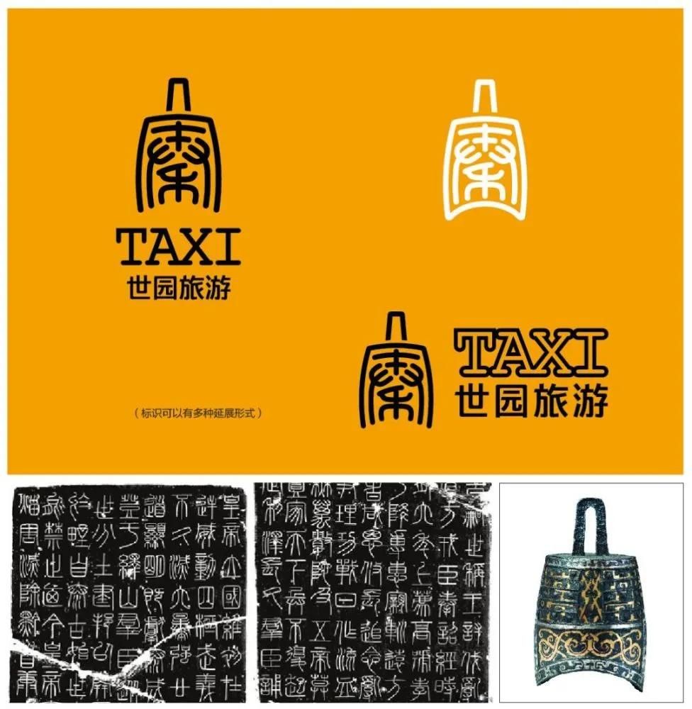
A: The most common seen product is the visual image design of taxis cars in Xi'an. Xi'an planned to add 10,000 methanol taxis cars in 2019, which required a new design in the car image. As the designer of the program, I hope to integrate the landmarks and representative cultural relics of Xi'an into my design.
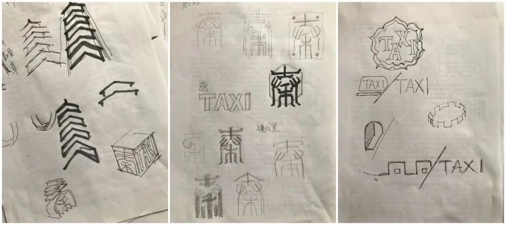
For example, the Bell Tower and the Giant Wild Goose Pagoda have beautiful architectural profiles, and I have restored this unique landmark of Xi'an in terms of lines and shapes. For example, Daming Palace, as the former site of the Tang Dynasty, is known as the "Palace of Thousands of Palaces". I extracted the elements of the eaves of Tang Dynasty and reproduced the cultural characteristics of the "Palace of Thousands of Palaces". I also use the small seal font of Chinese character "Qin" (秦) for the Qinyuefu chime. The blank is neat, the strokes are firm and robust, and the shape is organically combined with the shape of the Yuefu chimes, which fully reflects the fact that culture is the soul of Xi'an.

This proposal is also being applied now. The orange taxi cars in the street carry the images of the Big Wild Goose Pagoda, Bell Tower, the Qinyuefu Chime and the Palace of a Thousand Palaces which were designed by me.
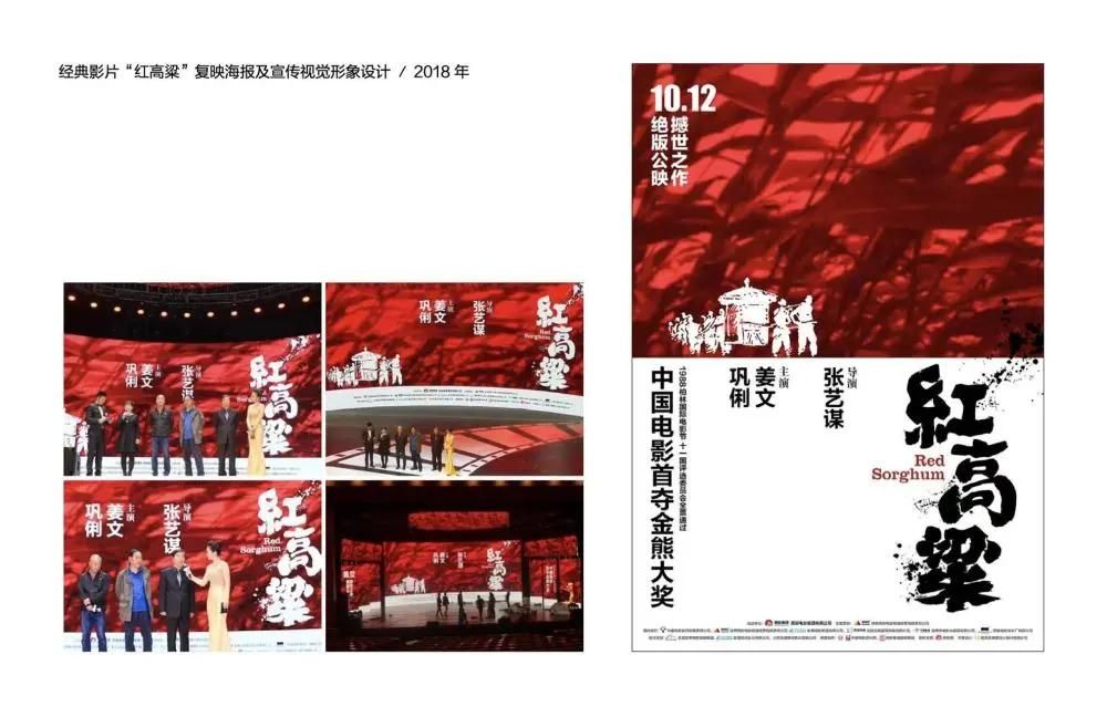
I have also done some film poster design, such as the series of posters for returning Zhang Yimou's film "Red Sorghum" back to screen in 2018, including the opens version, the director version, the award-winning version and the main poster. We took clips of the film for the main poster: a large close-up of red sorghum, with a classic shot of the sedan chair on it. We chose calligraphy font with strong visual characteristics. It is relatively open, with some splashing ink dots, expressing the full mood of the film.
There are also some non-profit posters. Like this cultural poster designed for reading, it was inspired a poem by Su Shi, a famous scholar in Song Dynasty: "wearing tattered clothes but looking talented with knowledge as support." In the process of poster design, I used the graphic symbols of a hanger and the text "book" (书) together to endow the text "book" with some clothing characteristics. Your best clothes are actually the books you have read, your knowledge and your insight.
Q: What do you usually do in your spare time?
A: Still designing (laughing). I usually study font design when I's mot occupied with busy work. Each font has its unique temperaments. A complete font library has about 20,000 to 30,000 Chinese characters. If you want to make a complete font library, it may take one or two years for a person alone. I've been working on two sets of fonts recently. For example, this official Song typeface was inspired by the shape of an ancient Chinese official cap. There are two wings on both sides of the official cap, so I integrate the wings into the transition of the stroke.
The idea of this Run Song typeface comes from the pearl round jade, so I integrate this full curve into the strokes of the font, like dripping water droplets.
Chinese characters have various changes and personalities between strokes. In such a small text, the designer needs to calm down and carefully comprehend its changes. A single Chinese character contains a lot of skill, fun and hard work.
Q: What are your expectations for your students?
A: As a teacher, I certainly hope that students will become excellent designers after graduation, but everyone will have different life and opportunities. Even if not everyone will become a designer, I hope that learning design will bring lifelong benefits to students.
In the future, if someone becomes a civil servant or a company employee... I also hope they are an expert in aesthetics before contracting with others for the design work. When they make some decisions, they will move a step forward in the aesthetics of this city and even the country. Aesthetic education should be a quality education for all people. We may not be able to change the aesthetics of the whole society in a short period of time, but I hope that students graduating from Xi'an Eurasia University can make some contribution to the aesthetic literacy of the society.
